Mobile app · Usability-led
Booking a table and ordering food in one app, refined through two usability studies.
- Role
- UX Designer
- Year
- 2023
- Platform
- Mobile
- Methods
- Interviews, journey mapping, usability studies
At a glance
Problem
People juggle separate apps to book tables and order food, with no help choosing where to eat.
Solution
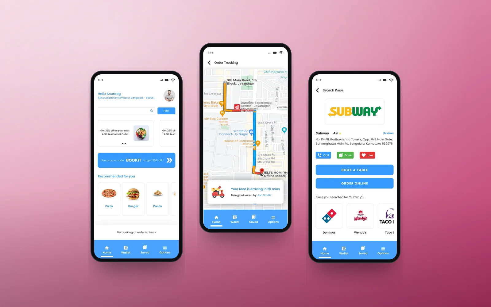
One app that books, orders and recommends, with fewer pages and details filled in from your account.
My role
Research, paper and digital wireframes, lo-fi and hi-fi prototypes, and two usability studies.
Outcome
Peer feedback praised how easy it was to get what you want without navigating many pages.
Problem
Too many apps, too many steps
Booking a table and ordering food meant different apps. Newcomers to a city also struggled to pick where to go, and text-heavy booking flows felt like a chore.
Insights
What the research showed
Not just personal use
Research showed people also pick restaurants for work gatherings, not only for themselves.
New in town
Unfamiliarity with an area made some people avoid going out altogether.
Anxious moments
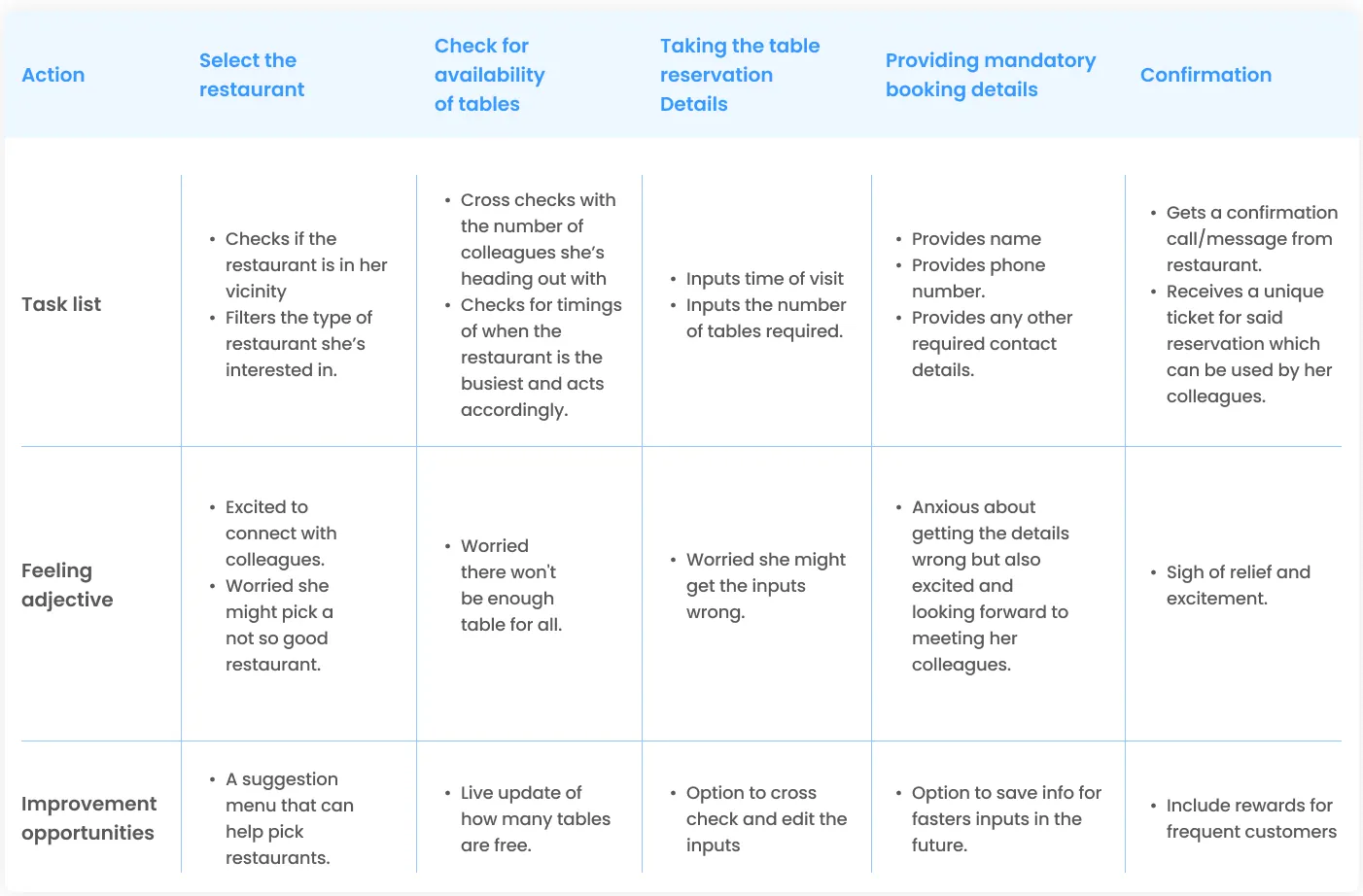
The journey map showed worry about table availability and getting booking details wrong.
Key decisions
How the design answers it
- 01
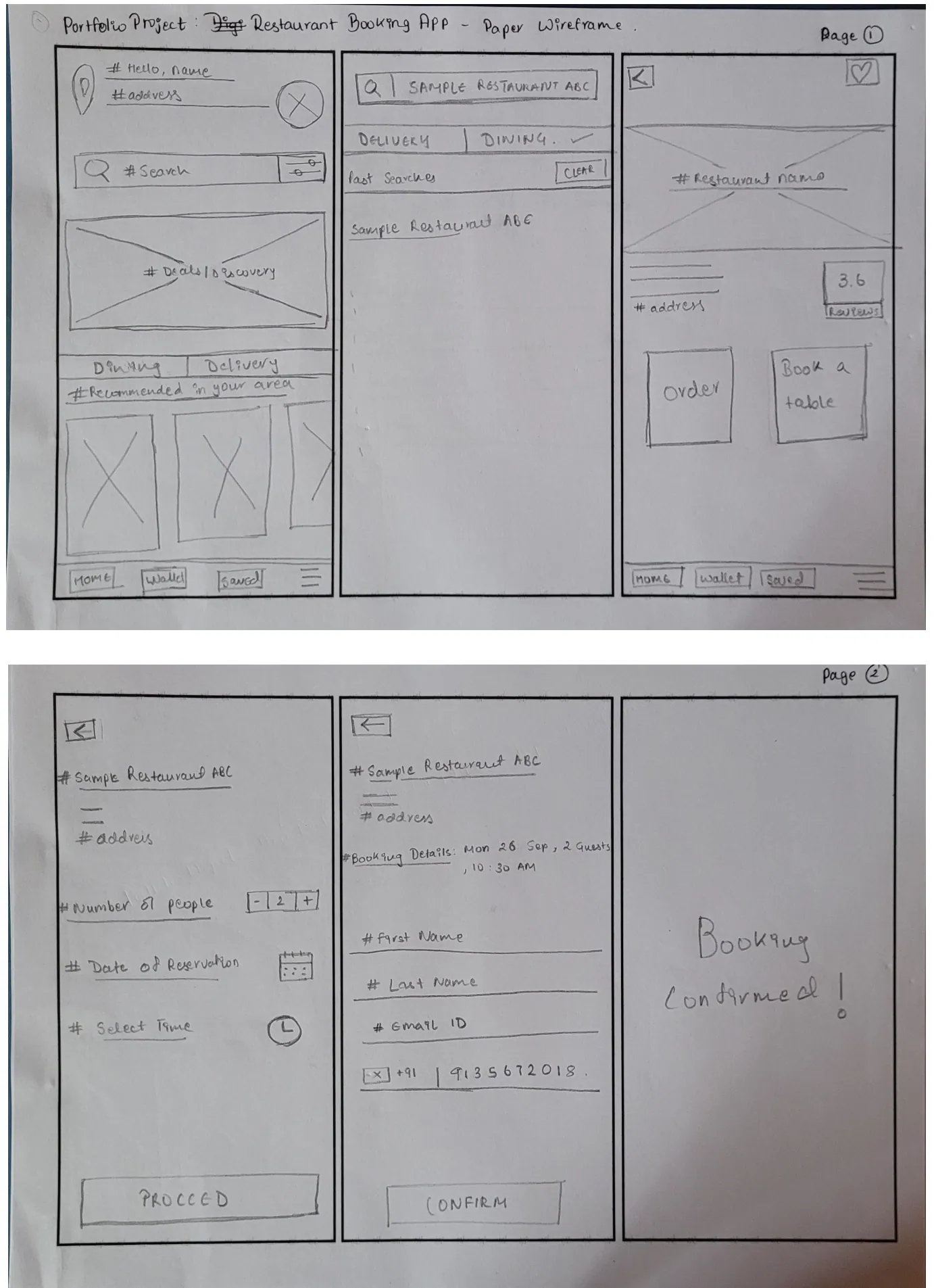
Book or order from the same page
Each restaurant page leads straight to booking or ordering. After testing, I added call, save and like, plus recommendations based on your searches.
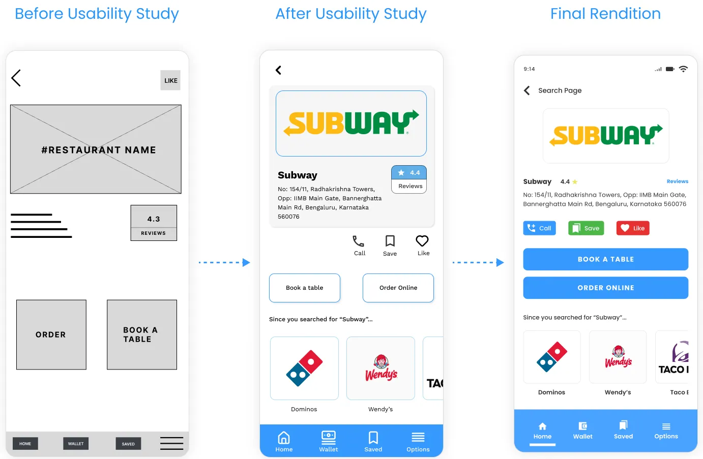
Before, after testing, and final. - 02
Fix what testing found
Round one removed a redundant booking page and added payment confirmation. Round two added a sticky header and footer and live order tracking.
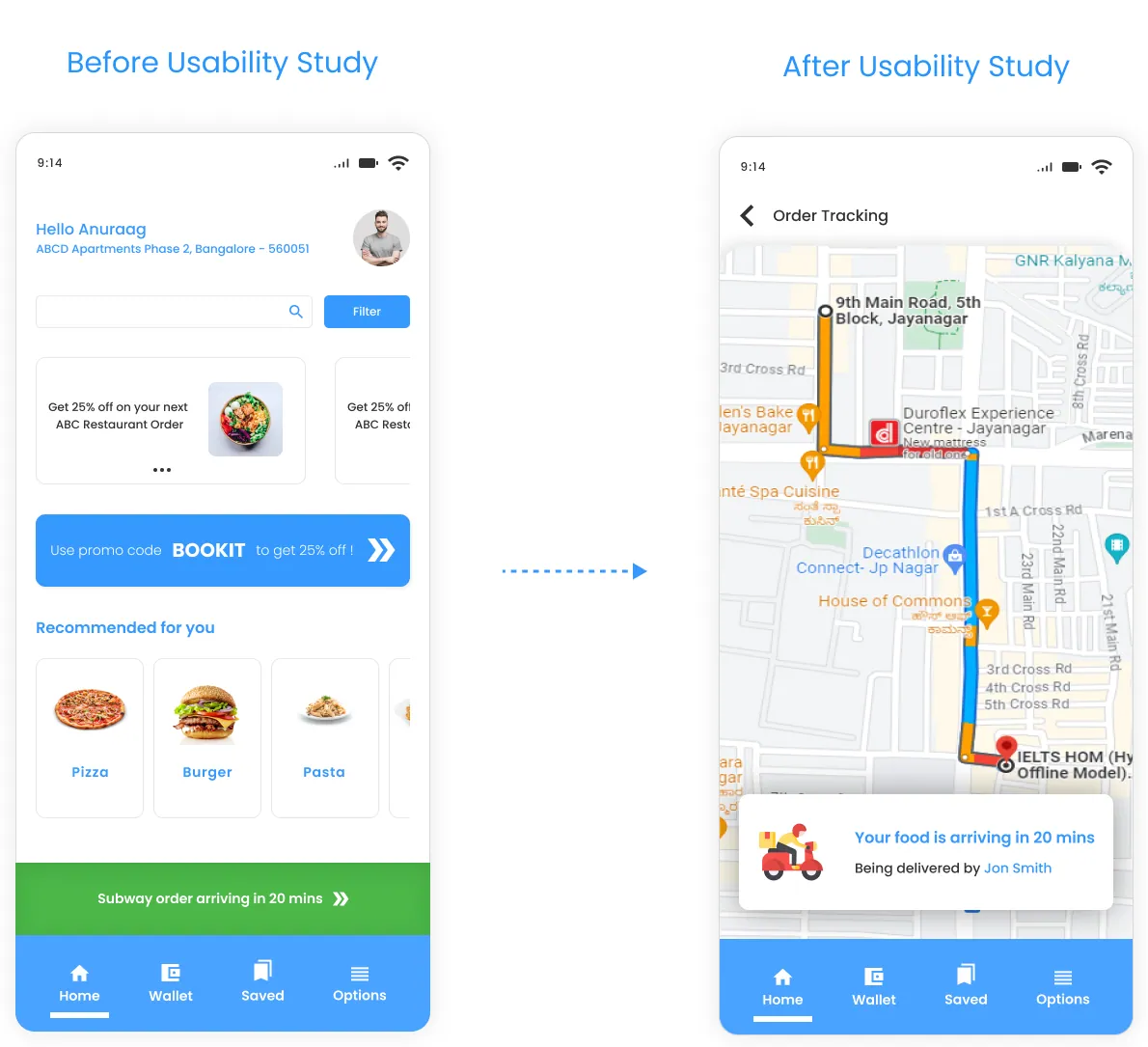
Order tracking with the delivery route and rider, added after testing. - 03
Accessible by default
Standard icons with captions, speech-to-text search, and enough colour contrast for people with visual impairments.
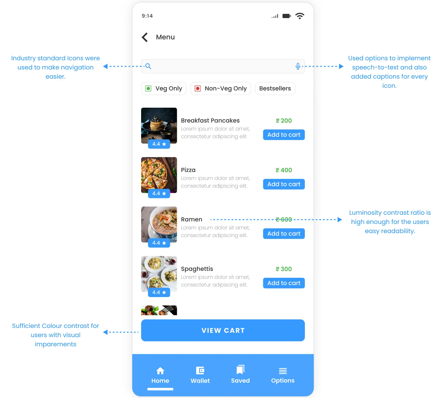
Accessibility considerations.
Final design
The screens
Outcome
What I learned
- Peer feedback highlighted the user-friendly interface and getting things done without many pages.
- There's no one-size-fits-all design. Each round of testing changed something.
- Next: more usability studies and better recommendations.
Want the full process? Read the original case study on Behance(opens in a new tab).