Community app · Mobile and desktop
Letting residents control who comes in, without constant calls from the gate.
- Role
- UX Designer
- Year
- 2024
- Platform
- Mobile and desktop
- Methods
- Interviews, empathy maps, usability studies
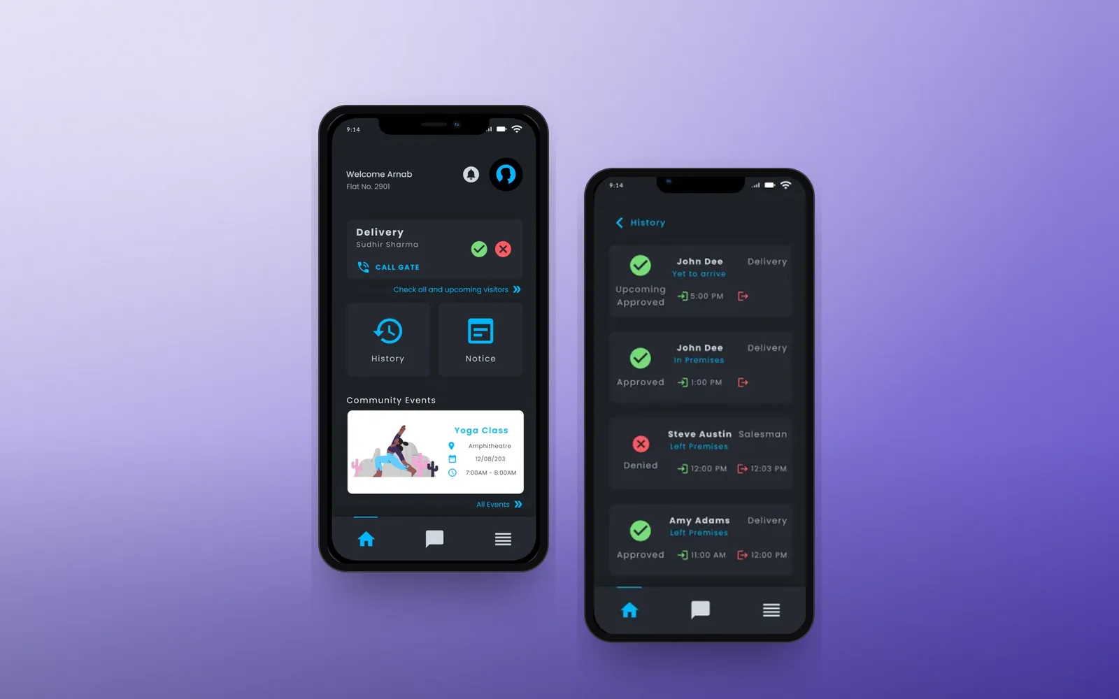
At a glance
Problem
Manual visitor entry is slow, constant security calls are disruptive, and residents miss community updates.
Solution
One app to approve or deny visitors, review entry history, and create or follow community events and notices.
My role
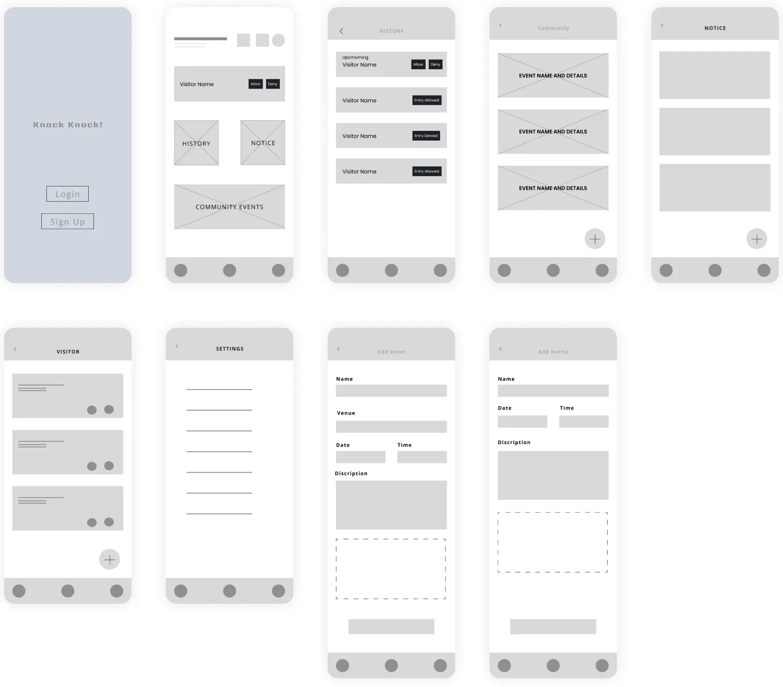
Interviews, paper and digital wireframes, lo-fi and hi-fi prototypes, usability studies and accessibility.
Outcome
Hi-fi prototypes for mobile and desktop.
Problem
Visitors, security and updates, all handled badly
Residents faced delays from manual entry procedures, felt unsafe with weak security measures, and lost track of important community updates.
Insights
What the research showed
Two opposite needs
Some residents hated constant security calls. Others wanted to monitor every visitor.
One shared wish
Both groups wanted a quick, seamless way to grant entry.
Community matters too
Residents asked for event coordination and a way to post notices.
Key decisions
How the design answers it
- 01
Visitor decisions on the home screen
The next visitor appears first, with approve, deny and call-gate actions right there.
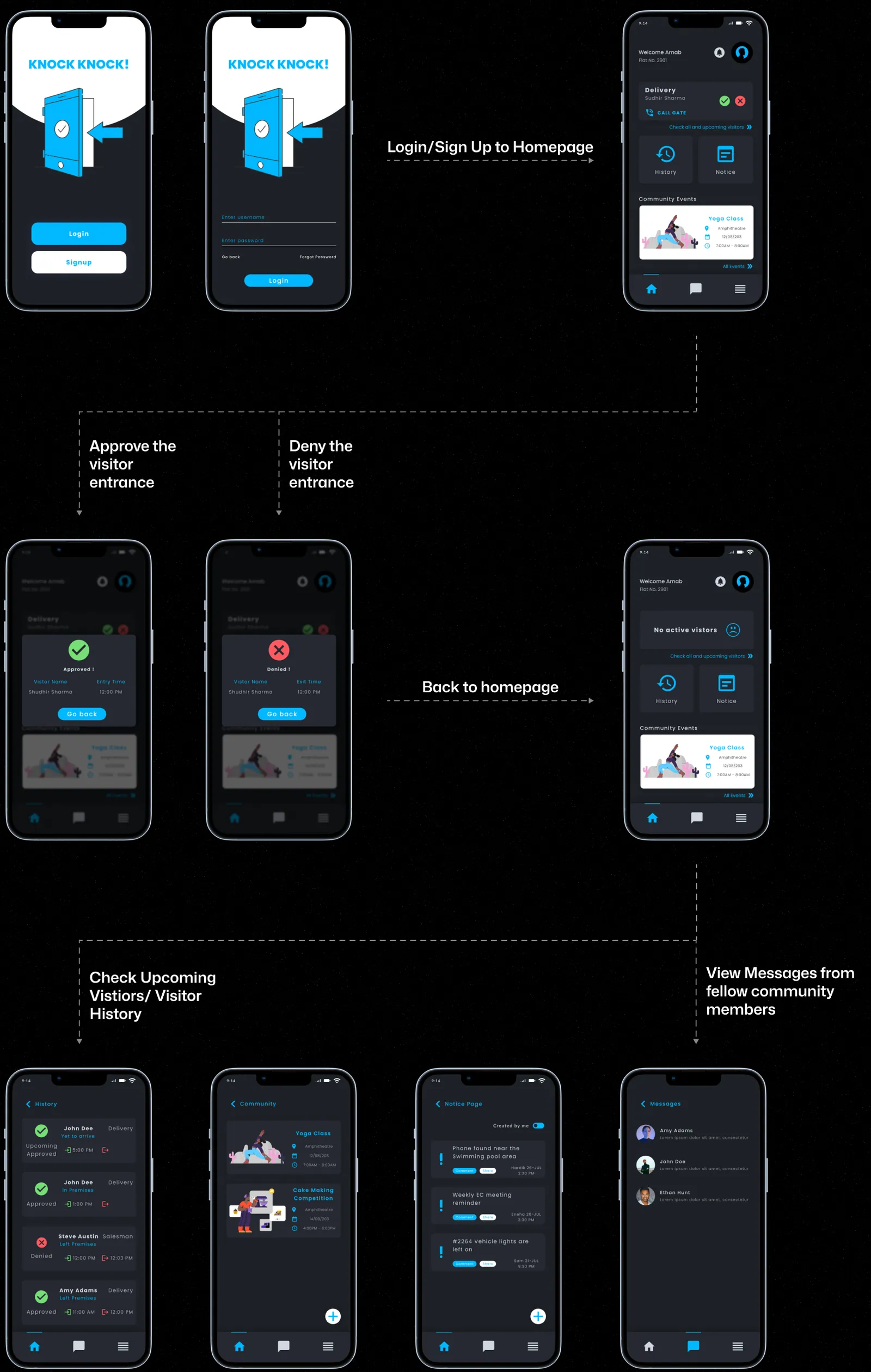
From approving a visitor to history, events, notices and messages. - 02
A simple structure
Everything branches from one home: history, notices, events, messages, notifications and options.
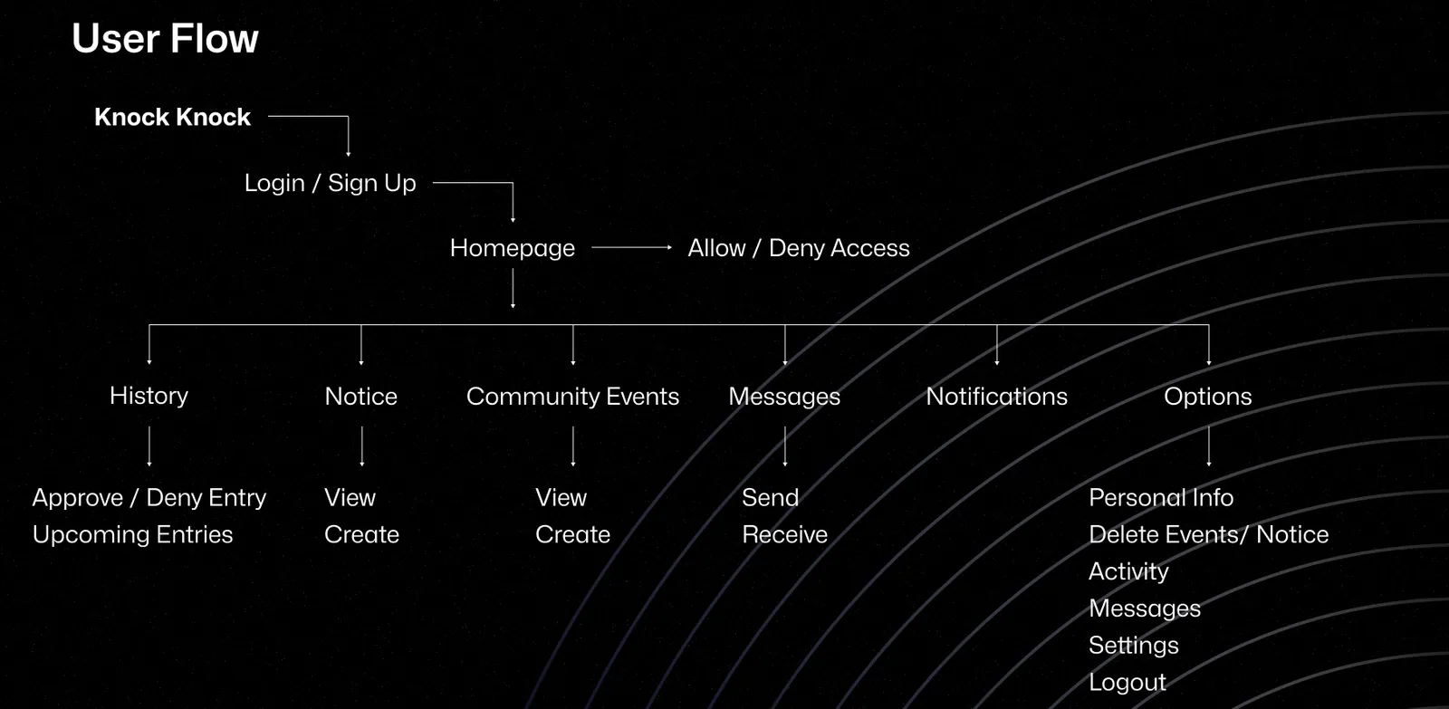
User flow. - 03
A desktop version for managing the community
The desktop app handles current visitors, events and notices on a larger screen.
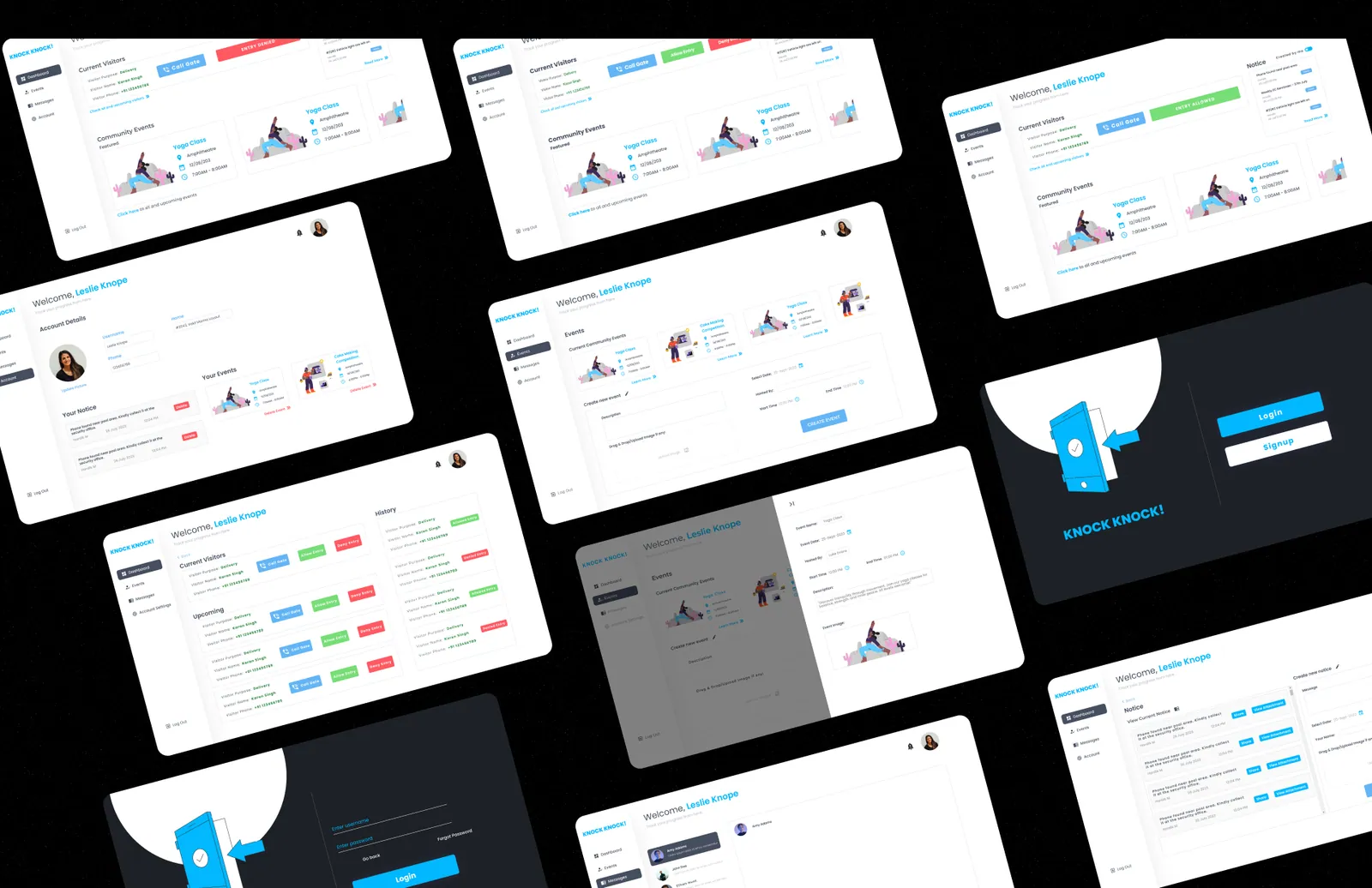
Desktop mockups.
Final design
The screens
Outcome
What came out of it
- A visitor flow that serves both residents who want fewer calls and those who want more control.
- Event and notice tools that came directly from what residents asked for.
Want the full process? Read the original case study on Behance(opens in a new tab).